
To build a Power BI dashboard from Excel data, start by treating the workbook as a data source rather than a formatted report. You will load structured Excel tables into Power BI Desktop, make repeatable changes in Power Query, model the data, create reusable measures, and design a focused report. After publishing, you can optionally pin selected report visuals to a Power BI service dashboard.
This project uses a sales workbook, but the workflow applies equally well to operational, finance, inventory, or customer-service data with a clear row-level structure.
What You Will Build in This Power BI From Excel Project
Project scenario and expected deliverables
Use an Excel workbook with three named Excel Tables:
- Sales: OrderID, OrderDate, ProductID, CustomerID, Region, Quantity, and SalesAmount.
- Products: ProductID, ProductName, Category, and Subcategory.
- Customers: CustomerID, CustomerName, Segment, and City.
Each Sales row represents one product on one order: an order line. Repeated OrderID values are expected because an order can contain multiple products. That grain is why the project counts distinct orders rather than counting Sales rows.
Define what SalesAmount means before loading the file. For example, it might represent signed net sales, with returns stored as negative values. If cancelled orders remain in the source, decide whether to exclude them before loading or analyze them with an explicit status rule.
The finished overview page answers four questions: How much did we sell? How many orders and units produced that result? How has sales changed by month? Which categories and regions contribute most? It includes KPI cards, a sales trend, category and regional comparisons, and a small set of slicers. A Product Detail page is optional.
If your workbook uses different field names, map them to this schema before starting. For example, Invoice Number can serve as OrderID, Transaction Date as OrderDate, Revenue as SalesAmount, and Item Code as ProductID. Keep a short validation note with the Excel total for SalesAmount, the distinct OrderID count, total Quantity, and one filtered total for a region or category.
Power BI report vs. Power BI service dashboard
The word dashboard has a specific meaning in Power BI. In Power BI Desktop, you create a report: one or more interactive pages containing visuals, filters, and drill paths. In the Power BI service, a dashboard is a separate, single-page canvas made from tiles pinned from reports and other supported content.
This walkthrough builds the report first because the model and analysis live there. Once the report is published, a stakeholder who needs a one-page monitoring view can pin selected visuals to a service dashboard. See Microsoft’s dashboard overview for current terminology and service behavior.
Prepare the Excel Workbook Before Loading It
Use clean, structured Excel Tables
In Excel, select each data block and choose Insert > Table. Name the tables Sales, Products, and Customers. Named Excel Tables give Power BI explicit headers and a defined data area, making them a more dependable source than loosely maintained worksheet ranges.
Each table should have one header row, unique and meaningful column names, and one type of value per column. Keep title rows, merged cells, blank separators, subtotals, and manually calculated grand totals outside the table. Use stable IDs, such as ProductID and CustomerID, for relationships instead of product or customer names that can be edited or repeated.
Check data quality and grain
Ask what one row represents in every table. Repeated OrderID values in Sales can be valid order lines. Duplicate ProductID values in Products or CustomerID values in Customers, however, need investigation because those columns are intended to be unique lookup keys.
- Confirm that OrderDate contains actual dates, not a mixture of date values and text.
- Confirm that Quantity and SalesAmount are numeric, and document the treatment of returns and cancellations.
- Check that ProductID and CustomerID values in Sales have matching values in their lookup tables.
- Remove only genuine duplicate records. A repeated value is not automatically a duplicate transaction.
Choose a storage location with refresh in mind
Decide how Power BI Desktop will reach the workbook before you build the report. A workbook saved in a synchronized OneDrive or SharePoint folder may look like a cloud file in File Explorer, but browsing to it can create a local file-path connection. That path is not the same as a cloud connection when the Power BI service later refreshes the model.
| Source route | Connection used in Power BI Desktop | Service refresh implication |
|---|---|---|
| Local or network workbook | Use Get data > Excel workbook and browse to the local or network path. | The Power BI service generally needs an on-premises data gateway that can reach that path, along with valid credentials and source mapping. |
| Workbook in a synchronized OneDrive or SharePoint folder | If you use Excel workbook and browse to the synced folder, the query normally uses that local path. | Treat it as a local-path source for refresh planning; cloud storage alone does not make this connection gateway-free. |
| Workbook in OneDrive for work or school or SharePoint Online | Use Get data > SharePoint folder, enter the SharePoint site URL, filter to the workbook, and open its binary Content in Power Query. | For this cloud-source route, a gateway is not normally required merely to reach the cloud file. Configure cloud credentials and test refresh in the service. |
OneDrive for work or school is backed by SharePoint Online, so the cloud route uses the relevant SharePoint site URL rather than a synced desktop path. For a team report, store the workbook in an approved team location and record the workbook owner, expected update schedule, and table names the model depends on. Microsoft documents the SharePoint Folder connector and the broader Power BI refresh model.
Load Excel Data into Power BI Desktop
Connect to the workbook and select Tables or sheets
For a local or network workbook, select Home > Get data > Excel workbook, browse to the file, and inspect the objects in Navigator. Select the named Sales, Products, and Customers tables rather than similarly named worksheets where possible.
For the cloud route described above, select Home > Get data > SharePoint folder, enter the SharePoint site URL, then choose Transform Data. Filter the file list to the intended workbook before selecting its Content value. Power Query then exposes the workbook objects for selection. Do not point this route at a local OneDrive sync path.
In either case, use the preview as a quality checkpoint. Confirm that the first row is the expected header row, required columns are present, and no report title or total row has entered the data area. Microsoft’s Excel workbook connector documentation covers the connector used for workbook contents.
Choose import, not a vague “live” connection
For this project, load the Excel tables into an imported Power BI model. That gives you a copy of the shaped data in the semantic model and supports the relationships and measures used later in the report.
Placing a workbook in OneDrive or SharePoint does not make the report a generic live connection to Excel. It changes where Power BI retrieves the file and how refresh is configured. Use the import route unless your organization has a separately designed and tested architecture.
Decide when to Transform Data instead of Load
Select Transform Data when types need correction, labels need standardizing, or report-only rows have entered the source. Select Load when the preview is already clean and correctly typed.
The practical test is repeatability: if the same correction will be needed after next month’s update, create a Power Query step instead of repairing the finished report by hand.
Clean and Shape the Data in Power Query
Set data types and handle nulls or errors
In Power Query, review the type icon beside each important column. Set OrderDate to Date, Quantity to Whole Number, SalesAmount to an appropriate decimal or fixed-decimal type, and IDs and categories to Text. Automatic type detection is a starting point, not proof that a type is correct. This is especially important for IDs with leading zeroes and dates interpreted under different regional settings.
Inspect nulls and errors before removing anything. A blank CustomerID may represent an unknown customer; an error in SalesAmount may reveal a source value such as “N/A.” Correct the workbook where practical, or apply an explicit and documented query rule. Microsoft explains the available options in Dealing with errors in Power Query.
Remove non-data rows and standardize labels
Remove fully blank rows and repeated headers or totals that slipped into a source range. Standardize labels that describe the same category but differ only in capitalization, punctuation, or whitespace, such as “Home Office,” “Home office,” and “Home-office.” Trim text values when unnecessary spaces create separate categories.
Do not filter blank ProductID values automatically. First determine whether they are accidental records, sales that should be assigned to an Unknown category, or exceptions that the business needs to monitor.
Keep transformations traceable
Rename queries clearly. Sales, Products, and Customers are more useful than Sheet1 or Table2. The Query Settings pane records transformations in Applied Steps; inspect a step whenever a row count, type, or value changes unexpectedly. When the queries are ready, select Close & Apply to load the shaped tables into the model.
Build a Simple, Reliable Data Model
Identify fact and dimension tables
Sales is the fact table: it contains events and numeric values at the order-line level. Products and Customers are dimension tables: they add descriptive fields used to group and filter those events.
This distinction guides the report. Measures such as Total Sales belong with fact data or in a dedicated measures table. Fields such as Category, Segment, and CustomerName belong on axes, slicers, and labels.
Create and validate relationships
In Model view, create these active relationships:
Products[ProductID](one) toSales[ProductID](many).Customers[CustomerID](one) toSales[CustomerID](many).Date[Date](one) toSales[OrderDate](many), after creating the Date table.
The key on the one side must be unique. Keep single-direction filtering unless the model has a specific reason to change it: Products, Customers, and Date should filter Sales. Both-direction filtering can be useful in carefully designed models, but it can also create ambiguous filter paths. Review Microsoft’s relationship guidance before changing cardinality or cross-filter direction.
Then test for unmatched keys. Create a temporary visual with Products[Category] and a Sales measure. An unexpected (Blank) category can indicate Sales ProductID values that do not match Products. Repeat the check with a Customer field, then correct missing or mistyped keys before relying on category or customer analysis.
Add a proper date table when time analysis requires it
This report uses a dedicated Date table because it needs a monthly trend and may include a prior-year comparison. In Power BI Desktop, choose Table tools > New table and create a contiguous date range that begins on January 1 of the first sales year and ends on December 31 of the last sales year:
Date =
VAR FirstDate = DATE(YEAR(MIN(Sales[OrderDate])), 1, 1)
VAR LastDate = DATE(YEAR(MAX(Sales[OrderDate])), 12, 31)
RETURN
    CALENDAR(FirstDate, LastDate)
Select the Date table, choose Table tools > Mark as date table, and select Date[Date]. This project assumes Sales[OrderDate] has already been converted to a valid Date type and that the date range contains complete calendar years. Those conditions matter when you use classic time-intelligence functions.
Choose Table tools > New column and add these columns:
Year = YEAR('Date'[Date])

Month Start = DATE(YEAR('Date'[Date]), MONTH('Date'[Date]), 1)

Year-Month = FORMAT('Date'[Month Start], "YYYY-MM")
Sort Date[Year-Month] by Date[Month Start], then create the active Date-to-Sales relationship. Use Year-Month, rather than Month Name alone, on a multi-year monthly trend; Month Name would combine every January across years. See Microsoft’s guidance on date tables and the CALENDAR function.
Create the Measures for the Dashboard
Start with core KPIs
Choose Table tools > New measure and create the following measures. A measure gives Total Sales or Total Orders one reusable definition, so cards, charts, matrices, and later report pages evaluate the same business logic under their current filters.
Total Sales = SUM(Sales[SalesAmount])

Total Orders = DISTINCTCOUNT(Sales[OrderID])

Units Sold = SUM(Sales[Quantity])

Average Order Value = DIVIDE([Total Sales], [Total Orders])
Format Total Sales and Average Order Value as currency, Total Orders and Units Sold as whole numbers, and any percentage measure as a percentage. Total Orders uses a distinct count because Sales is at order-line grain. Average Order Value returns blank when there are no orders.
If the source does not include SalesAmount, use a row-by-row formula only when the business defines line sales as Quantity multiplied by UnitPrice and UnitPrice already reflects the adjustments relevant to your analysis. In that limited case, SUMX(Sales, Sales[Quantity] * Sales[UnitPrice]) can define Total Sales. Do not substitute it for a net-sales field that includes discounts, returns, tax, or other adjustments not represented in UnitPrice.
Add a time comparison only when the model supports it
After the Date table is complete, marked as a date table, and actively related to Sales, you can add a prior-year comparison:
Sales PY =
CALCULATE(
    [Total Sales],
    SAMEPERIODLASTYEAR('Date'[Date])
)

Sales YoY % =
DIVIDE([Total Sales] - [Sales PY], [Sales PY])
Use these measures only when the data contains a meaningful comparable prior period. If the current or prior period is incomplete, make that limitation clear or choose a comparison that better fits the reporting question. Microsoft documents the behavior and date requirements of SAMEPERIODLASTYEAR.
Validate measures before designing visuals
Validate each calculation at the same aggregation level used in Excel. Compare an unfiltered Total Sales card with the Excel sum of SalesAmount, Units Sold with the Excel sum of Quantity, and Total Orders with an Excel distinct count of OrderID. Then create a matrix by Region or Category and reconcile several rows and the grand total with Excel.
Apply one slicer value at a time, such as a region or category, and repeat the check. A transaction-level table containing measures is not the best proof of accuracy because measures evaluate in the visual’s filter context and can repeat an aggregate across many detail rows.
Design the Interactive Power BI Report
Plan the page around business questions
Start with the questions defined for the project rather than a gallery of chart types. Place Total Sales, Total Orders, Units Sold, and Average Order Value at the top. Below them, show a monthly sales trend, sales by category, and sales by region. Put transaction or product detail on a second page only when readers need to investigate it.
Build the core visuals and slicers
- Cards: Total Sales, Total Orders, Units Sold, and Average Order Value.
- Line chart: Date[Year-Month] on the X-axis and Total Sales as the value.
- Bar chart: Products[Category] and Total Sales, sorted descending.
- Regional comparison: Sales[Region] and Total Sales. Use a bar chart if the labels are not genuine geographic areas.
- Slicers: Date, Region, and Category.
Apply consistent number formats. Use labels when they make comparison easier; otherwise, keep the chart clear and use a well-designed tooltip for exact values.
Configure interactions, drill-through, and accessibility
Select Format > Edit interactions to check what happens when a reader selects a bar, line point, or slicer value. Keep interactions that support the overview questions and disable ones that create unexplained changes elsewhere on the page.
Add drill-through only for a named follow-up question. For example, a Product Detail page can show monthly sales, top customers, and order-line detail for the selected product.
Use descriptive visual titles, adequate contrast, and labels or icons in addition to color. Add meaningful alt text to non-decorative visuals, set a sensible tab order, and make sure important findings are not available only through hover tooltips. Microsoft provides current recommendations in Design Power BI reports for accessibility.
Review for clarity and responsiveness
Test the page with typical filters before publishing. Confirm that titles state what is being measured, blank areas are understandable, formats are consistent, and default filters show a useful starting view. Remove any visual that does not answer the sales, trend, category, regional, or follow-up detail question defined for this project.
Publish the Report and Create a Service Dashboard
Publish from Power BI Desktop to the correct workspace
Save the PBIX file, select Publish in Power BI Desktop, and choose the workspace approved for the intended audience. In the Power BI service, reopen the report and test the filters, default page, and several totals already validated against Excel.
Workspace roles, report sharing, and app distribution serve different purposes. Use the organization’s approved workspace and governance process, and do not treat a distribution method as a substitute for data authorization or row-level security where it is required.
Pin key visuals to a dashboard if needed
If a one-page monitoring surface is useful, open the published report in the service and use the pin action on selected visuals to add them to a new or existing dashboard. A pinned tile links readers back to the report for deeper analysis. Dashboard creation and pinning can depend on permissions, licensing, and tenant settings, so confirm that the option is available in your environment. See Microsoft’s dashboard creation guidance for the current workflow.
Share responsibly
Before distributing the report, decide who may view the data, who needs to edit content, and whether anyone needs permission to build new content from the semantic model. A curated app can suit broad distribution, while workspace membership is generally for collaborators who manage content. Follow organizational practices for sensitivity labels, sharing, and data access.
Set Up Refresh for Excel-Based Reports
Configure the refresh route you actually used
Match service settings to the connection created in Power BI Desktop. A model that queries a local or network Excel path needs a configured on-premises data gateway that can reach that path when refresh runs. A model that uses the SharePoint Folder connector to reach a OneDrive for work or school or SharePoint Online workbook uses cloud credentials for that source and does not normally need a gateway solely for file access.
After publishing, open the semantic model settings in the service. Confirm credentials, configure the gateway connection when applicable, and set a refresh schedule only after a manual refresh succeeds. The available options depend on source type, capacity, licensing, workspace configuration, and tenant policy. Microsoft’s scheduled refresh documentation explains the relevant settings and troubleshooting categories.
Test refresh and document ownership
Run a manual refresh, inspect refresh history, and verify that the expected workbook changes appear in the report. Document who updates the workbook, who owns the semantic model credentials, when source data is ready, and who receives failure notifications. A successful desktop refresh does not prove that the Power BI service can reach the same source.
Troubleshoot Common Excel-to-Power BI Problems
Data types, headers, and unexpected blanks
If OrderDate shows errors or groups incorrectly, inspect the Power Query type step and the source values. Regional date formats can make apparently valid values ambiguous. If fields become Column1 or Column2, check whether Power Query promoted the wrong row to headers. If category labels appear duplicated, inspect whitespace, punctuation, and capitalization before creating a model rule.
Incorrect totals or duplicated values
Start with grain. A line-level Sales table cannot be counted as though every row were a unique order. Next, inspect keys and relationships: duplicate values on a supposed one-side key, unmatched values, many-to-many relationships, and unintended both-direction filtering can all produce surprising totals. Also check the visual aggregation. A measure such as Total Orders is appropriate; summing an ID column is not.
Refresh failures after publishing
Check whether the published model points to a local path or the intended SharePoint cloud route. Then investigate changed paths, unavailable network folders, expired credentials, insufficient permissions, and gateway availability. Use refresh history and semantic model settings to identify the failing connection before following Microsoft’s scheduled refresh troubleshooting guidance.
Project Checklist and Next Steps
- The workbook uses named Excel Tables with one header row and no embedded totals.
- Sales grain, SalesAmount meaning, return treatment, and key fields are documented.
- The connection route is intentional: local-path Excel Workbook connector or cloud SharePoint Folder connector.
- Power Query applies understandable, repeatable cleanup steps.
- Products, Customers, and Date have validated one-to-many relationships to Sales.
- Core measures reconcile with Excel at unfiltered and selected summary levels.
- The monthly trend uses a chronological Year-Month axis.
- The published report and its refresh route have been tested in the Power BI service.
From here, the most useful next skills are deeper Power Query transformations, star-schema design, reusable DAX measures, date-table techniques, and accessible report design. Each builds on the model and reporting habits established in this project.
Build a Power BI Dashboard From Excel Data
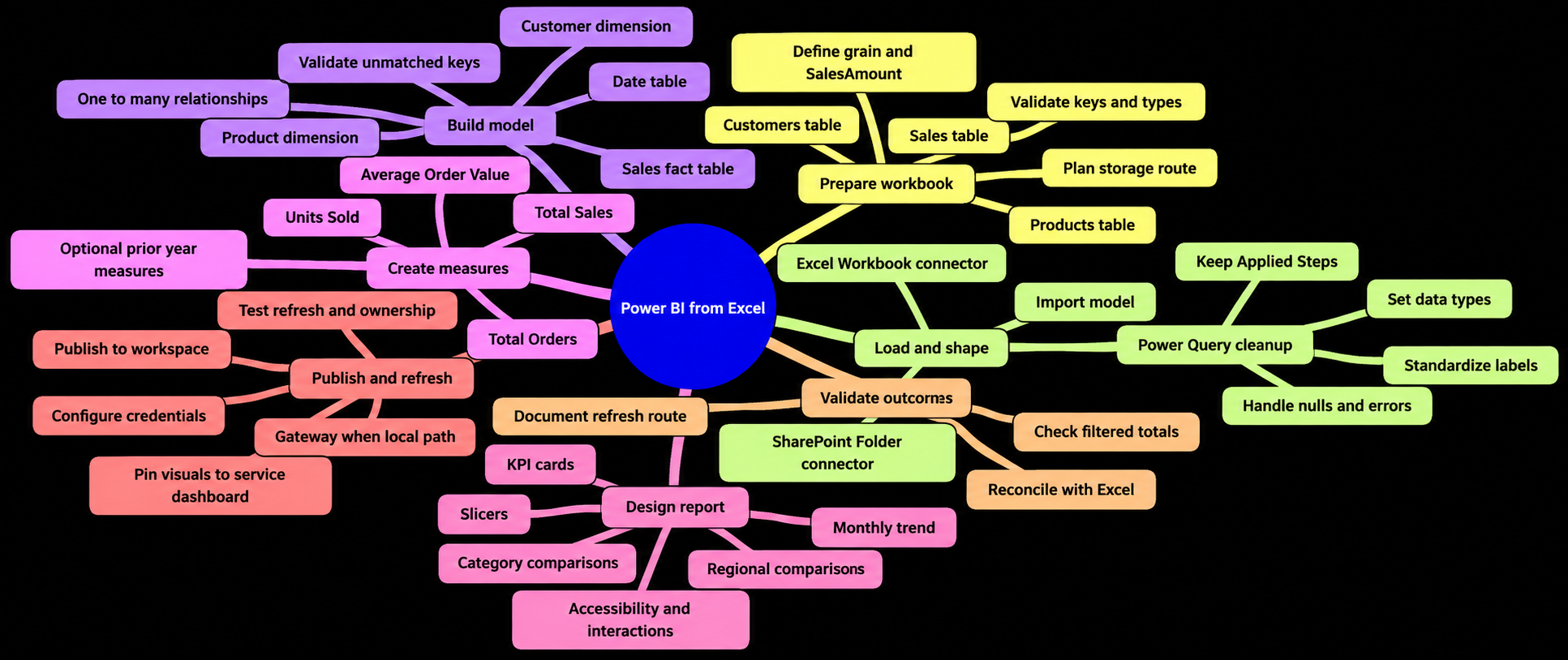
Frequently Asked Questions
Can I build a Power BI dashboard from an Excel workbook?
Yes. Load structured Excel Tables into Power BI Desktop, shape them in Power Query, create relationships and measures, and design an interactive report. After publishing, you can optionally pin selected report visuals to a Power BI service dashboard.
How should Excel data be structured before importing it into Power BI?
Use named Excel Tables with one header row, unique column names, stable IDs, and one type of value per column. Keep title rows, merged cells, blank separators, subtotals, and manually calculated totals outside the tables.
Should I use Excel tables or worksheets when importing data into Power BI?
Select the named Sales, Products, and Customers tables in Navigator where possible. Tables provide explicit headers and defined data areas, making them a more dependable source than loosely maintained worksheet ranges.
What is the difference between a Power BI report and a dashboard?
A Power BI Desktop report can contain multiple interactive pages, visuals, filters, and drill paths. A Power BI service dashboard is a separate, single-page canvas made from tiles pinned from reports and other supported content.
How do I connect Power BI to an Excel file in SharePoint or OneDrive?
For a cloud-source route, use Get data, choose SharePoint folder, enter the SharePoint site URL, filter to the workbook, and open its Content value in Power Query. Browsing to a synchronized local folder instead creates a local-path connection for refresh planning.
Why should Total Orders use a distinct count?
The Sales table is at order-line grain, so one order can contain multiple rows with the same OrderID. DISTINCTCOUNT(Sales[OrderID]) counts orders rather than counting every product line.
How should I validate a Power BI report against Excel?
Compare Total Sales with the Excel SalesAmount sum, Units Sold with the Quantity sum, and Total Orders with an Excel distinct count of OrderID. Reconcile selected Region or Category totals and test individual slicer selections.
What does an Excel-based Power BI report need for scheduled refresh?
The refresh setup depends on the connection route. A local or network workbook generally requires an on-premises data gateway, while a SharePoint Folder connection to a OneDrive for work or school or SharePoint Online workbook uses cloud credentials and normally does not need a gateway solely for file access. Test a manual refresh before scheduling one.
Sources
- Dashboard overview in Power BI service — Microsoft Learn.
- Excel workbook connector — Microsoft Learn.
- SharePoint Folder connector — Microsoft Learn.
- Data refresh in Power BI — Microsoft Learn.
- Dealing with errors in Power Query — Microsoft Learn.
- Model relationships in Power BI Desktop — Microsoft Learn.
- Design guidance for date tables in Power BI Desktop — Microsoft Learn.
- CALENDAR function — Microsoft Learn.
- SAMEPERIODLASTYEAR function — Microsoft Learn.
- Design Power BI reports for accessibility — Microsoft Learn.
- Create a Power BI dashboard from a report — Microsoft Learn.
- Configure scheduled refresh — Microsoft Learn.